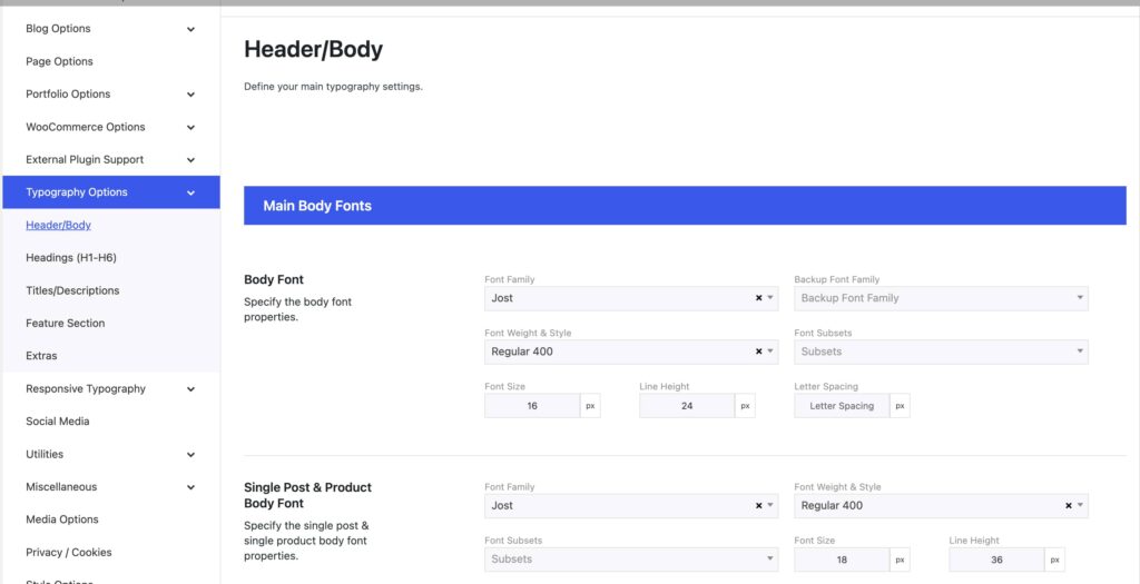
This is a fully customizable font-related section. You can change the fonts and style according to your tastes/needs for almost every case. The font sections are divided so you can easily find the font you seek to customise.
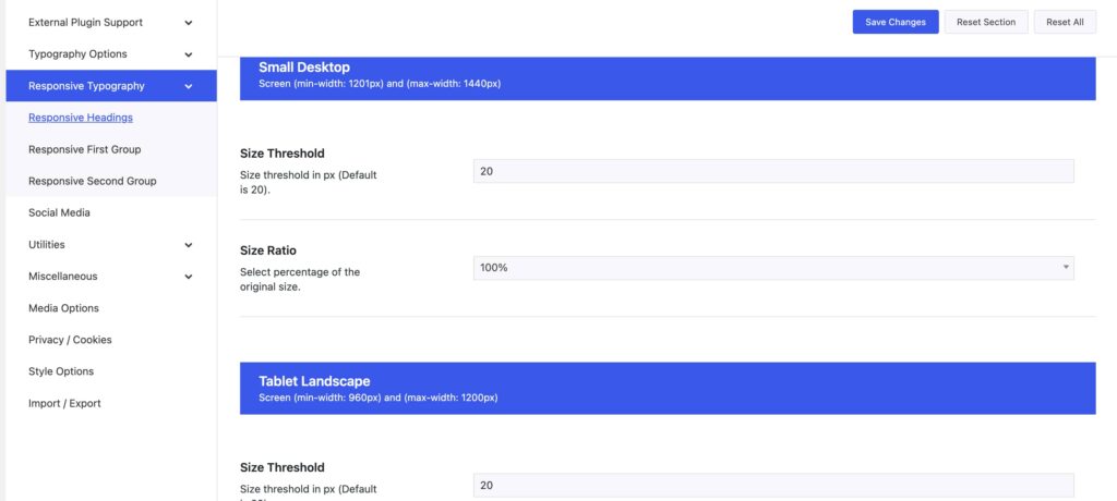
A fantastic feature of Somentra is the Responsive Typography. You can fully customise the font-size for devices, whether a small laptop (max-width 1440 pixels), a tablet (in both landscape & portrait) or a mobile device. Let’s see what the Responsive Typography concept is about. First of all, you set a Size Threshold for a given device. The size Threshold defines the minimum value point from which the Responsive size ratio percentage will take effect. In other words in order to make use of a given Size Ratio percentage, the default font size under the Typography Options should be equal or larger than the Size Threshold, otherwise there will be no effect at all. You have three customizable sections:
- The Responsive Headings, which define the Headings H1-H6
- The Responsive First group, which defines the Title elements: Page / Post / Feature Section Titles
- The Responsive Second group defines the Description elements: Page / Post / Feature Section Descriptions and leader Text, Subtitle Text, Link Text, and Buttons.
Last but not least, you can set your custom Font Families under Theme Options > Typography Options > Extras to use extra fonts in various elements and the Feature Section.


