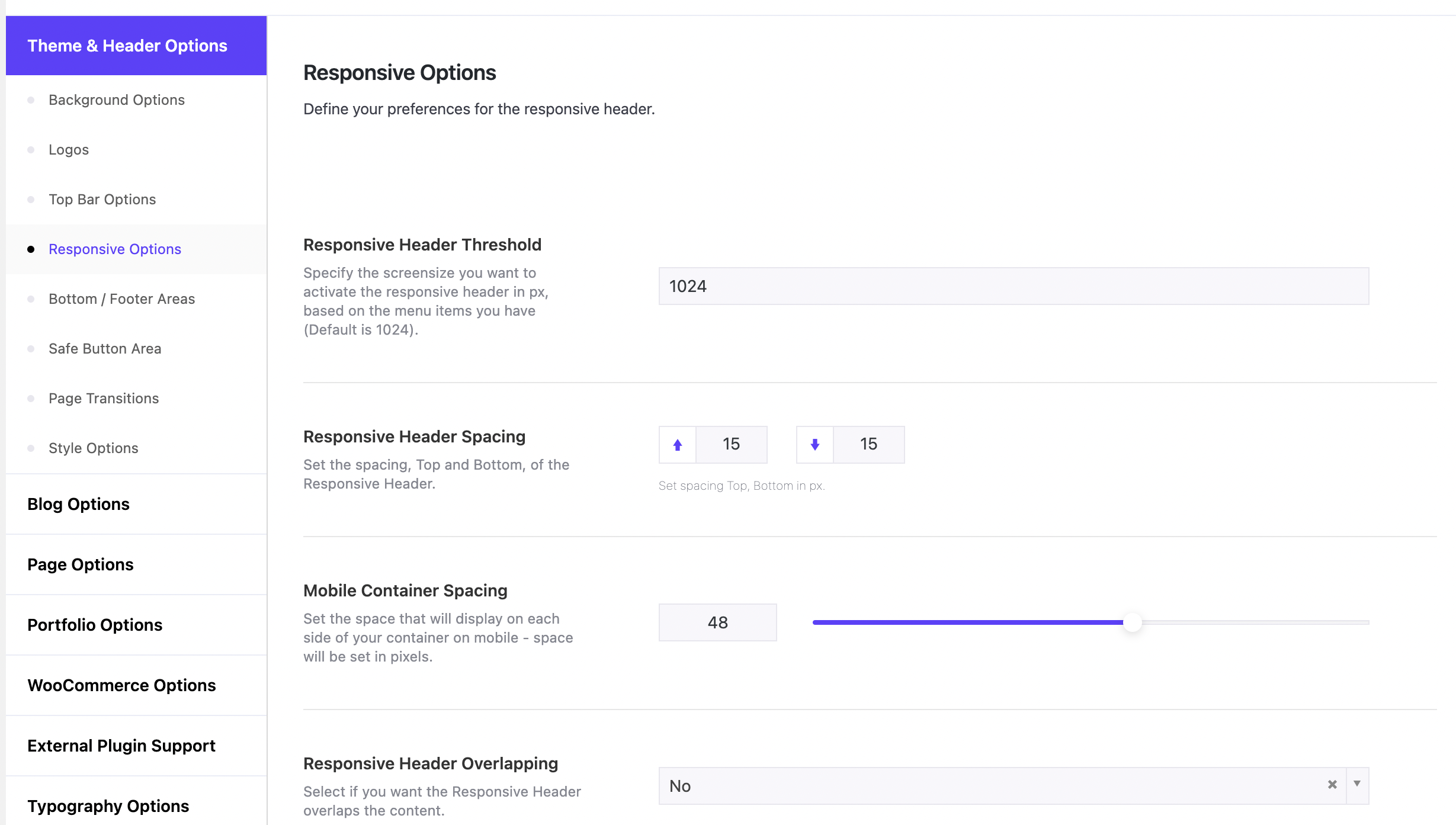
Under Theme Options > Theme & Header Options > Responsive Options you can set up your preferences for the Responsive Header and Menu. Firstly, you can specify the screen size you want to activate the responsive header in pixels. If you have many menu items the menu will probably overlap the logo on smaller screens. The solution is to switch to the responsive header on larger screen sizes than the default one (1024 pixels). Anyone can set this threshold here. You can also define the height of the Responsive Header and the header overlapping on devices. Of course, you can set the logo height and position, enable sticky header on devices, set the responsive menu button, icon, animation, type, align, width, text, menu background image/color, and menu elements. You can actually design from scratch your responsive header and menu, no matter how you’ve designed your header.