To create a Portfolio Item, go to:
- Portfolio > Add New
- Add a title
- Add some content (you can use Elementor or Gutenberg Editor)
- Add a description for the title
- Add Quick View Title, text, and link text
- Add more details for the sidebar
- Add categories and item fields (extra info in a list style)
- Upload a featured image for your item
Portfolio Options
Here you can set everything you need apart from the content of the portfolio (you can use Elementor or Gutenberg editor for this). So, you will find the following, organized into tabs, sections:
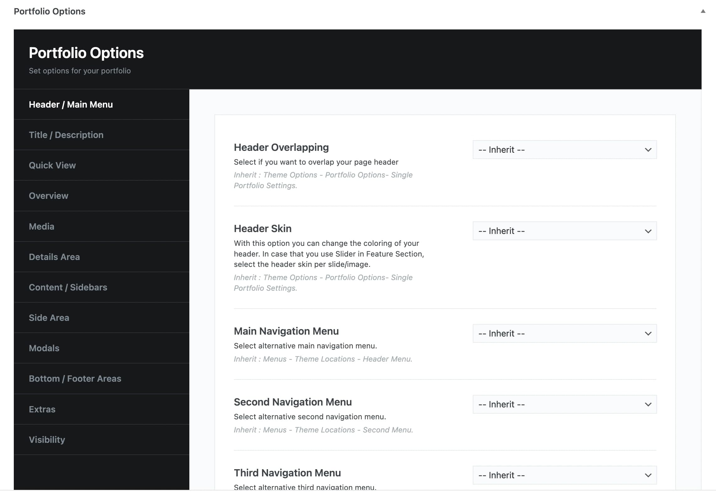
Header/Main Menu
Header overlapping: Select if you wish or not to overlap your portfolio item header. The option inherit means that you will get what you set globally under Theme Options > Portfolio Options in the Portfolio Header Settings.
Header Skin: With this option, you can select the color of your header among Default, Dark, or Light. The option inherit means that you will get what you set globally under Theme Options > Portfolio Options in the Portfolio Header Settings for your single items. In case you use Slider in the Feature Section, select the header style per slide/image.
Main Navigation Menu: Here, you can select an alternative main navigation menu. You can choose among any of the available menus or inherit the global one (Menu > Theme Locations > Header Menu).
Second Navigation Menu: Here, you can select alternative second navigation menu in case you are using a Header mode with 2 menu locations (under Theme Options > Basic Options > Theme & Header). You can choose among any of the available menus or inherit the global one (Menu > Theme Locations > Second Menu).
Third Navigation Menu: You can also set the Third Menu (Slide) in case you are using the third header layout style with the Slide Menu.
Responsive Navigation Menu: By this selection, you can select an alternative responsive navigation menu. You can choose among any of the available menus or inherit the global one (Menu > Theme Locations > Responsive Menu).
Sticky Header Type: With this option, you can just leave the inherit option (Theme Options > Basic Options > Theme & Header) or disable the Sticky Header.
Sticky Header Mode: Here, you can select if you need to keep the Main Header as your Sticky header or use the Custom Header Sticky.
Safe Button: With this option, you can select any of the available Safe Button area items or leave the global option (Theme Options > Basic Options > Theme & Header).
Responsive Header Overlapping: Here you can specify the behavior of the Responsive Header and if you need an overlapping with your content when the responsive header appears. Of course, you can just leave the inherit option (Theme Options > Basic Options > Theme & Header > Responsive Options).
Title/Description
Title/Description Visibility: Select visible if you wish your title and your description to be shown or hidden if you don’t want to show them.
Alternative Title: Add an alternative title if you don’t prefer the default title.
Description: Here, you can enter your portfolio description.
Title Options: Select among the Custom Advanced Title, the Simple Title, or leave the inherit option (Theme Options > Portfolio Options). With the Advanced title, you can set the padding per device, the container size to be default or large, background color, content background color, title color, description color, content size, content alignment, content position, content animation. Additionally, set your background with the following options: Color only, the Featured image, or a Custom image. Finally, you can define the background position, add a pattern overlay, color overlay, and opacity overlay to ensure that your content is readable.
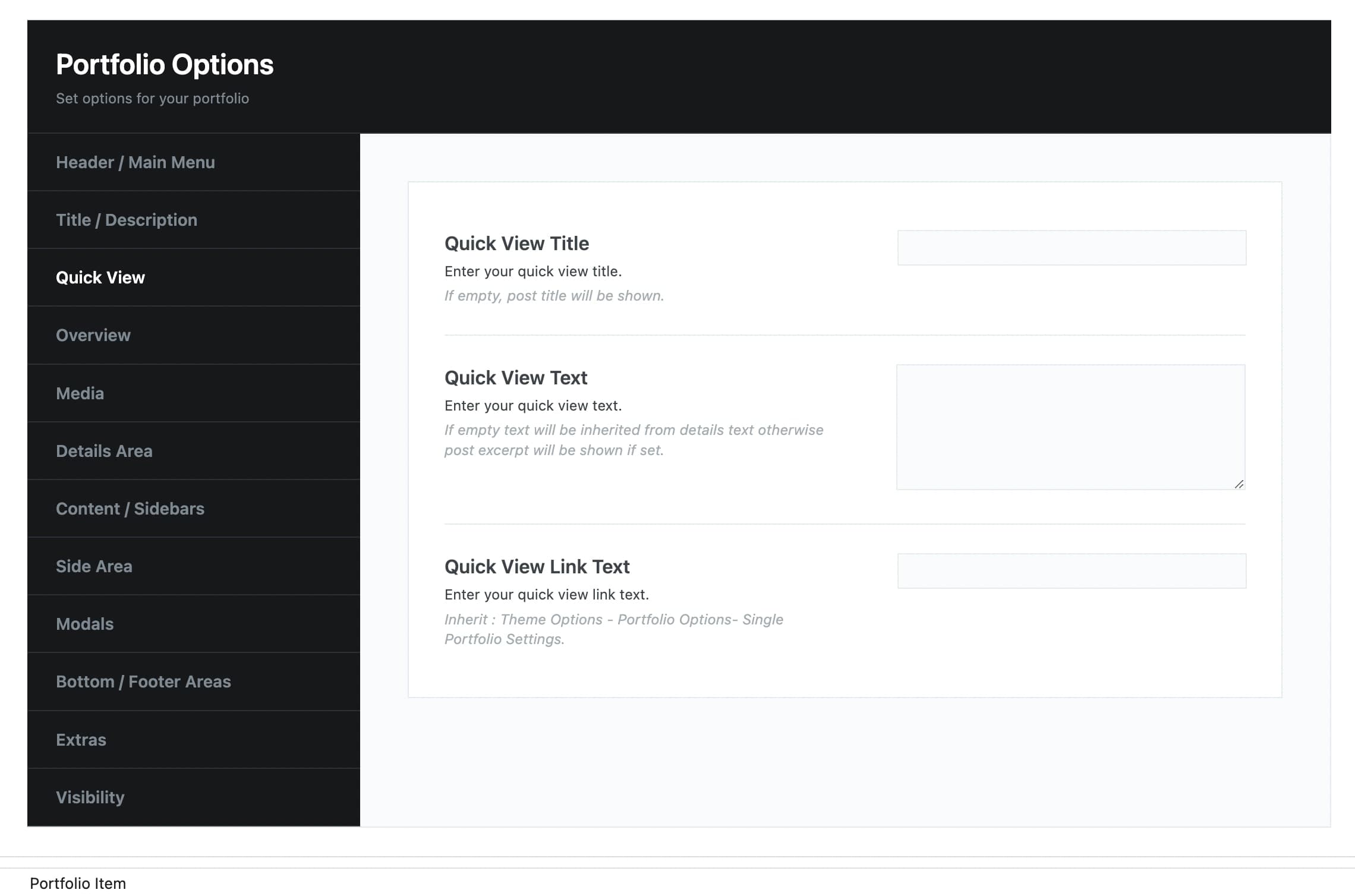
Quick View
Quick View Title: Enter a title for the Quick View
Quick View Text: Add the text you want to display on Quick View.
Quick View Link Text: Enter a text for the link on Quick View.
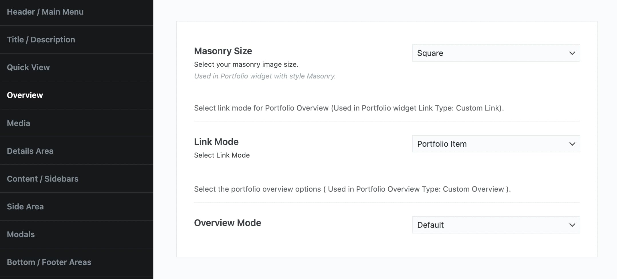
Overview
Masonry Size: You can choose the size of your masonry image among Square, Large Square, Landscape, and Portrait. In your Portfolio Element, you have to select the masonry style.
Link Mode: Here, you can choose your link mode, for your portfolio overview, among portfolio item, custom link, and none. You have to select the Custom Link option in the Portfolio Element, under Pagination & Extras > Link Type.
Overview Mode: Select the overview mode between default or with Custom Text.
Media
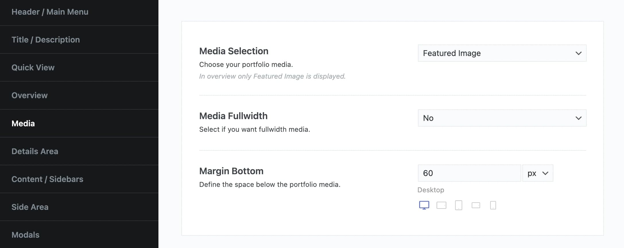
Media Selection: Select the portfolio media for your item. Here, you can choose your portfolio media among Featured Image, Second Featured Image, Classic Gallery, Vertical Gallery, Slider, YouTube/Vimeo Video, HTML Video, and none. In overview, only the Featured Image is displayed. The selection here will determine the below options.
Media Fullwidth: Select if you want fullwidth media or not.
Margin Bottom: Define the space below the portfolio media.
Image Mode: Select the image mode between Auto Crop and Resize.
Slideshow Speed: You can add the speed of your slides.
Navigation Buttons: Here you can select the style of your navigation buttons.
Navigation Buttons Color: In this field, you can choose the color of your navigation buttons between dark and light.
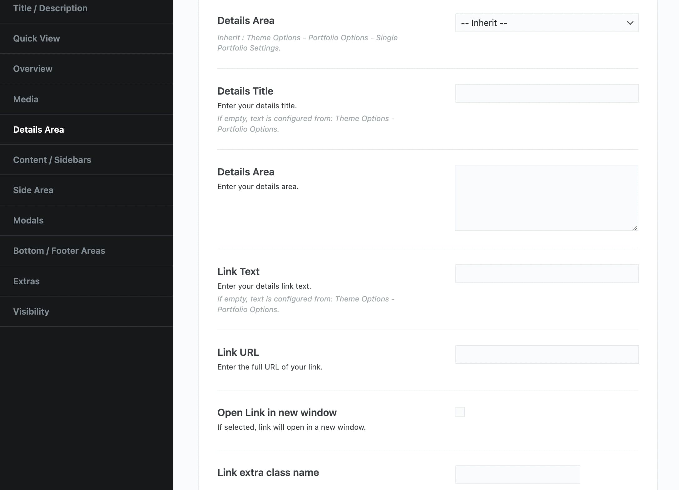
Details Area
Details Area: Select if you want to enable Details Area and below add the content for this area.
Details Title: Here, you can enter the details of your title. If you leave it empty, it will be configured from Theme Options > Portfolio Options.
Link Text: Here, you can write the details of your link text. If you leave it empty, it will be configured from Theme Options > Portfolio Options.
Link URL: Enter the full URL of your link.
Open Link in a new window: If you select it, the link will open in a new window.
Link extra class name: You can add your custom link class here.
Content/Sidebars
Padding: Define the space above and below the content area. If you select custom you can add Top and Bottom Padding per screen size.
Layout: Here, you can choose from full width, left sidebar, right sidebar, or inherit (Theme Options > Portfolio Options).
Sidebar: You can select any Widget Area you wish or leave the inherit option (Theme Options > Portfolio Options).
Fixed Sidebar: If you select it, your sidebar will be fixed.
Content Skin: Select the Skin of your content among Inherit, Dark, Light, or create your Custom one. Options are plenty here as well.
Inherit: Background from Theme Options > Basic Options > Theme & Header > Background Options, Colors from Appearance > Customize > Colors – Main Content.
Side Area
Side Area Visibility: You can choose your side area to be visible or not. You also select inherit (Theme Options > Portfolio Options).
Side Area Sidebar: Here, you can select which sidebar you want to use for your side area. You can select any Widget Area you wish or leave the inherit option (Theme Options > Portfolio Options).
Modals
You can create your modals for this item.
Bottom/Footer Areas
Sticky Areas: Select if you want to make Bottom/Footer Areas Sticky.
Bottom Bar Area: You can select an area item for your Bottom Bar Area. You can also choose from main safe button, footer homepage, footer, none, or inherit it from Theme Options > Basic Options > Theme & Header > Bottom/Footer Areas > Bottom Bar Area Item.
Footer Widgets Visibility: You can select the footer widgets to be visible or not. You can also choose Inherit (Theme Options > Basic Options > Theme & Header > Bottom/Footer Areas > Footer Widgets Settings).
Footer Bar Visibility: You can select the footer bar to be visible or not. You can also choose Inherit (Theme Options > Basic Options > Theme & Header > Bottom/Footer Areas > Footer Bar Settings).
Extras
Social Layout: Select if you need Bottom Layout or Side Layout.
Backlink: Here, you can select any page to be your backlink or you can inherit it from Theme Options > Portfolio Options.
Anchor Navigation Menu: Select any menu that you have created under Appearance > Menus as the anchor navigation menu.
Theme Loader Visibility: Here, you can select if you wish your theme loader to be visible or not. You can also select inherit (Theme Options > General Settings).
Visibility
Here, you can select the elements you possibly need to disable. Elements to hide: Top bar, Logo, specific Main Menu Items: Text, Search, Contact form, Language Selector, Shopping Cart, Social Icons, Breadcrumbs, the Content Area, and the Back to Top button.
With the most of the options above, you can override any options you have set in Theme Options > Portfolio Options. This means that you can handle individually each one of your portfolio items.
Feature Section
Vasty gives you the chance to add one of five special elements and to integrate your header with the feature section (Header Integration option).
You can select among:
- Title
- Image
- Video
- YouTube
- Slider
- Revolution Slider
- Map
- Posts Slider
Follow the guidelines to set up the Feature Element of your choice.
Finally, you can define various options in your feature section. Choose the background and content options. Keep in mind that you can also enable various effects and/or Buttons. Please check the related tutorials depending on the Feature element you will choose.