In this section, you can define your options for the Feature Section YouTube/Vimeo. Firstly, you set your Feature Section as you wish and then, you select your preferences for the YouTube/Vimeo video.
Have a closer look:
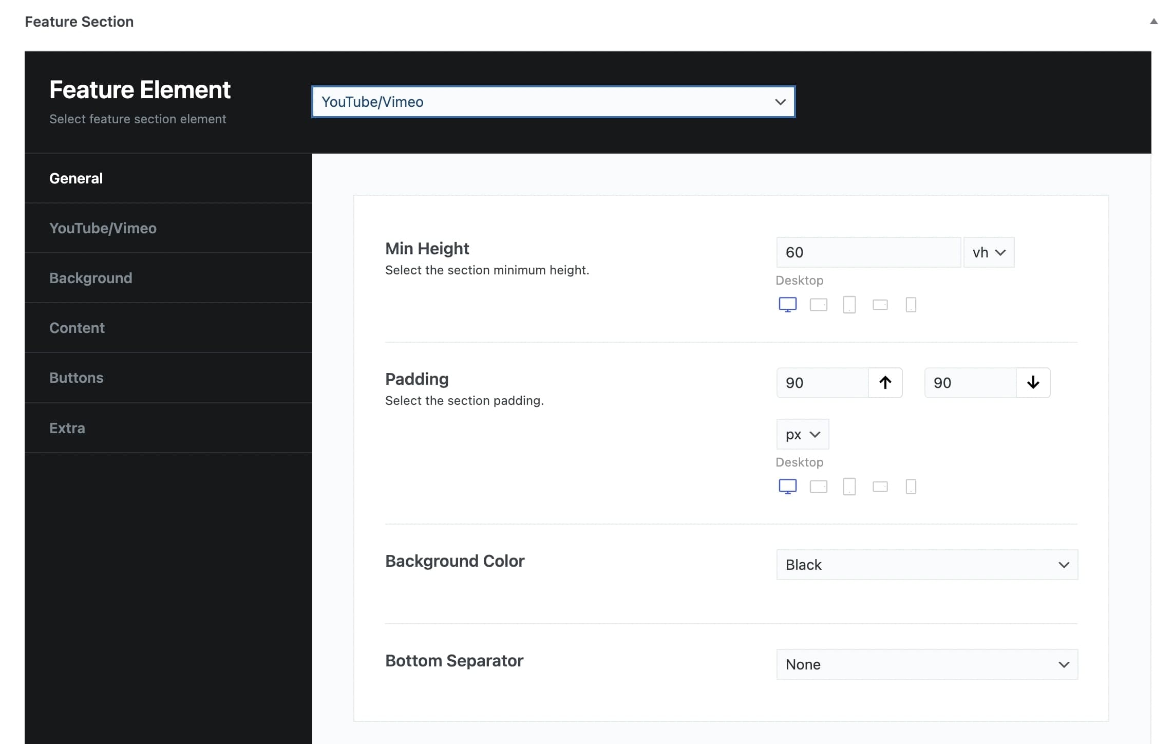
General tab
Min Height: You can select the minimum height of the feature video in vh or pixels and per screen size.
Padding: You can set the Top and Bottom Padding in pixels or % per screen size.
Background Color: You can choose one of the background colors given (transparent, gradient, primary, secondary, accent, text, black, white) or customize it by yourself by selecting the custom option.
Bottom Separator: A large variety is given to you to choose from. If you do not wish to use a separator you can select None.
Afterwards, you can define the options for the YouTube, Background, Content, Buttons, and Extra tab.
YouTube/Vimeo Video
YouTube/Vimeo link: Here, you can insert your YouTube link.
Start at: Define at which second you want your video to start.
End at: Define at which second you want your video to end.
Background
Background Image: Here, you can upload your background image.
Background Image Size: You can select the size of your background image among Responsive, Extra Extra Large, Full, or Inherit. If you choose Inherit you can define it under Theme Options – Media Sizes.
Background Position: Select the position of your background per screen size. A lot of options are given.
Pattern Overlay: Select if you wish to have a pattern overlay or not.
Color Overlay: You can choose your color overlay among Transparent, Gradient, Primary, Secondary, Text, Accent, Black, White, or Custom.
Opacity Overlay: Here, you can define the opacity of your overlay in %.
Content tab
Container Size: You can select the size of your container between the default one and the large one.
Graphic Image: Here, you can upload your image.
Graphic Image Size: You can choose your graphic image size between Resize (Medium) and Full Size.
Graphic Image Max Height: Here, you can define the maximum height of your graphic image per screen size.
Sub Heading: You can write your sub heading.
Title: Type your title.
Description: Type your description.
Content Background Color: Here, you can select the background color of your content among None, Primary, Secondary, Accent, Text, Black, White or Custom.
Sub Heading Color: You can choose your subheading color among Primary, Secondary, Accent, Text, Black, White or Custom.
Title Color: You can choose your title color among Primary, Secondary, Accent, Text, Black, White or Custom.
Description Color: Select among Primary, Secondary, Accent, Text, Black, White or Custom.
Sub Heading Tag: Select the tag for your sub heading.
Title Tag: Choose the tag for your title.
Description Tag: Choose the tag for your description.
Content Size: Here, you can choose the size of your content among Container Size, Large, Medium, or Small.
Content Alignment: Select the alignment of your content from Left, Right, or Center.
Content Position: A large variety of options is given to you for the position of your content.
Content Animation: Choose the animation you want to have for your content. You can select eight options.
Buttons
Button Text: Here, you can enter the text for your button.
Button URL: Enter the URL to which your button will be directed.
Button Target: Select if you want the button to be opened on a new page or on the same page.
Button Type: Select if you wish to have a Simple or Outline type.
Button Text Color: Choose the text color of your button.
Button Background Color: Choose the background color of your button.
Button Border Color: Choose the border color of your button.
Button Text Hover Color: Select the hover text color of your button.
Button Background Hover Color: Select the hover background color of your button.
Button Border Hover Color: Select the hover border color of your button.
Button Top Bottom Padding: You can choose the Top and Bottom Padding of your button per screen size.
Button Left Right Padding: You can choose the Left and Right Padding of your button per screen size.
Button Shape: Here, you can select the shape you wish for your button. Your options are Square, Round and Extra Round.
Button Shadow: Select the shadow of your button among Small, Medium, Large or None.
Button Class: Type the class of your button.
Extra
Scroll to Content: You can select among None, Arrow, or Arrow & Text.
Scroll to Content Text: Type the text you want to display.
Scroll to Content Color: Select scroll to content color.
Extra Class: If you wish to style this element differently, then use this field to add a class name and then refer to it in your CSS file.