Another amazing element for the feature section in Vasty. Upload your hero background image and define its size, custom or full screen. Place it below or above your site header and move on to the other endless possibilities and settings. Add a title and description, set your color preferences, add buttons with any shape and color, add the go down arrow for your first content section and so many more. Impress the world easily with Vasty 🙂
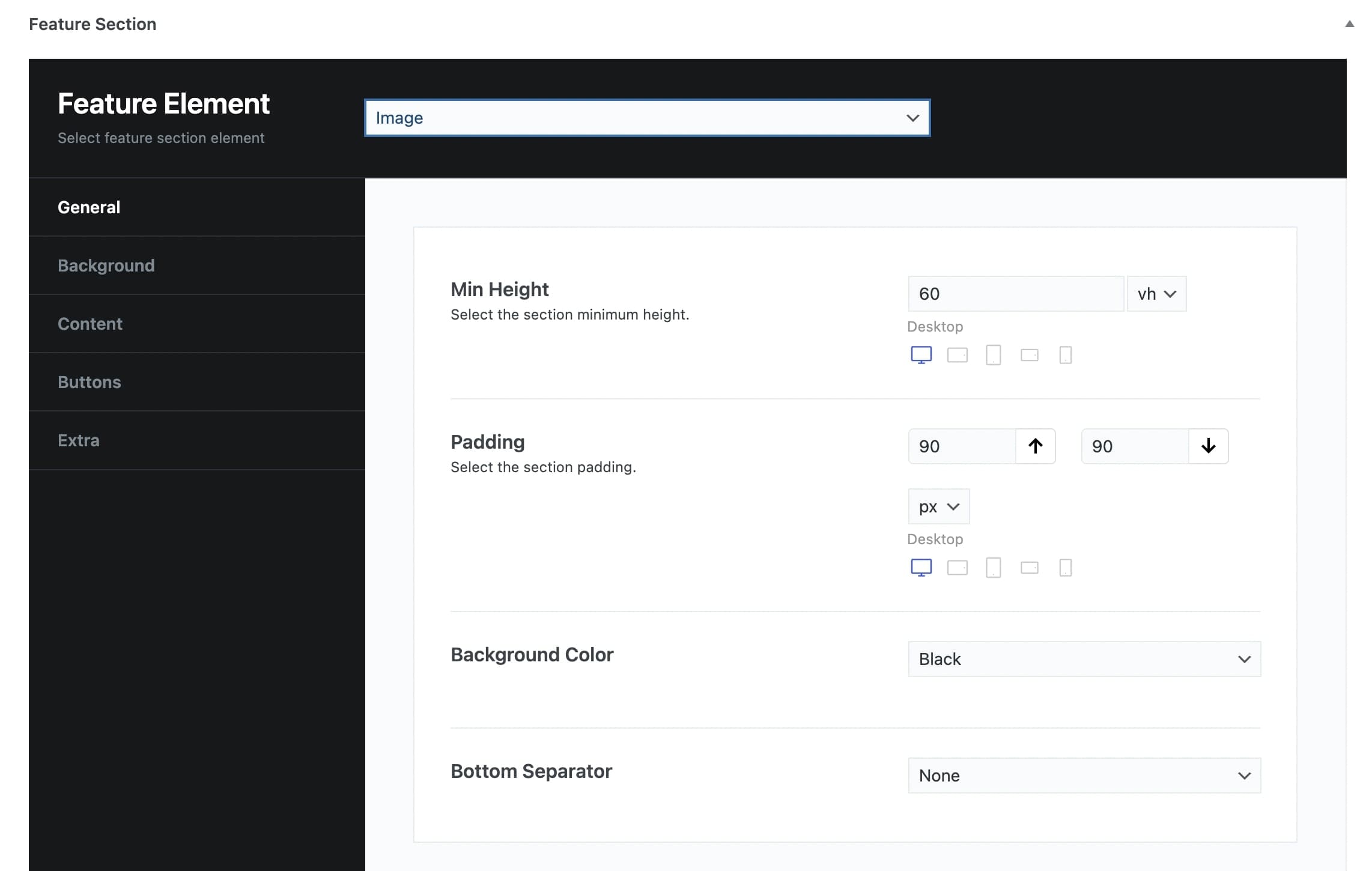
Have a closer look:
General
Min Height: You can select the minimum height of the feature image in vh or pixels and per screen size.
Padding: You can set the Top and Bottom Padding in pixels or % per screen size.
Background Color: You can choose one of the background colors given (transparent, gradient, primary, secondary, accent, text, black, white) or customize it by yourself by selecting the custom option.
Bottom Separator: A large variety is given to you to choose from. If you do not wish to use a separator you can select None.
Afterwards, you can define the options for the Content, Background, Buttons, and Extra tab.
Background
Background Image: Here, you can upload your background image.
Background Image Size: You can select the size of your background image among Responsive, Extra Extra Large, Full, or Inherit. If you choose Inherit you can define it under Theme Options – Media Sizes.
Background Image Position: Select the position of your background per screen size. A lot of options are given.
Background Effect: Choose the effect for your background among Animated, Classic Parallax, Advanced Parallax, or Fixed Section.
Pattern Overlay: Select if you wish to have a pattern overlay or not.
Color Overlay: You can choose your color overlay among Primary, Secondary, Accent, Text, Black, White, or Custom.
Opacity Overlay: Here, you can define the opacity of your overlay in %.
Content tab
Container Size: You can select the size of your container between the default one and the large one.
Graphic Image: Here, you can upload your image.
Graphic Image Size: You can choose your graphic image size between Resize (Medium) and Full Size.
Graphic Image Max Height: Here, you can define the maximum height of your graphic image per screen size.
Sub Heading: You can write your sub heading.
Title: Type your title.
Description: Type your description.
Content Background Color: Here, you can select the background color of your content among None, Primary, Secondary, Accent, Text, Black, White, or Custom.
Sub Heading Color: You can choose your subheading color among Primary, Secondary, Accent, Text, Black, White, or Custom.
Title Color: You can choose your title color among Primary, Secondary, Accent, Text, Black, White or Custom.
Description Color: Select among Primary, Secondary, Accent, Text, Black, White or Custom.
Sub Heading Tag: Select the tag for your sub heading.
Title Tag: Choose the tag for your title.
Description Tag: Choose the tag for your description.
Content Size: Here, you can choose the size of your content among Container Size, Large, Medium, or Small.
Content Alignment: Select the alignment of your content from Left, Right, or Center.
Content Position: A large variety of options is given to you for the position of your content.
Content Animation: Choose the animation you want to have for your content. You can select eight options.
Buttons
Button Text: Here, you can enter the text for your button.
Button URL: Enter the URL to which your button will be directed to.
Button Target: Select if you want the button to be opened on a new page or on the same page.
Button Type: Select if you wish to have a Simple or Outline type.
Button Text Color: Choose the text color of your button.
Button Background Color: Choose the background color of your button.
Button Border Color: Choose the border color of your button.
Button Text Hover Color: Select the hover text color of your button.
Button Background Hover Color: Select the hover background color of your button.
Button Border Hover Color: Select the hover border color of your button.
Button Top Bottom Padding: You can choose the Top and Bottom Padding of your button per screen size.
Button Left Right Padding: You can choose the Left and Right Padding of your button per screen size.
Button Shape: Here, you can select the shape you wish for your button. Your options are Square, Round, and Extra Round.
Button Shadow: Select the shadow of your button among Small, Medium, Large, or None.
Button Class: Type the class of your button.
Extra
Scroll to Content: You can select among None, Arrow, or Arrow & Text.
Scroll to Content Text: Type the text you want to display.
Scroll to Content Color: Select scroll to content color.
Extra Class: If you wish to style this element differently, then use this field to add a class name and then refer to it in your CSS file.