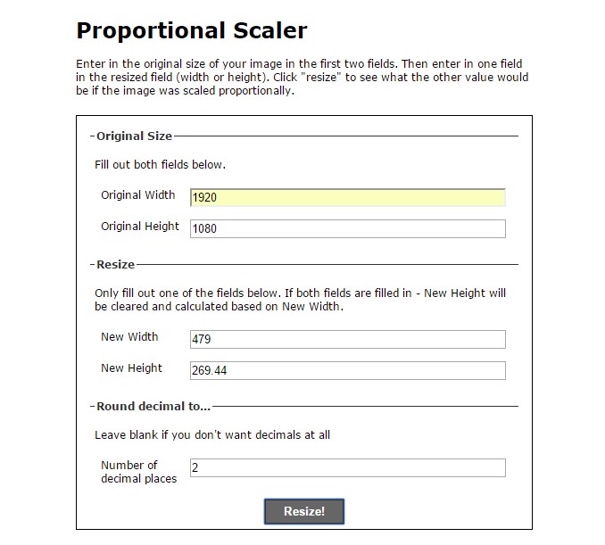
There is a common misconception about the full-screen background images and their behaviour in responsive mode. When we use an image of 1920 x 1080 in an ideal 1920 x 1080 desktop screen, the image we have used since it has its original size it appears in its full glory. We need this image to be full-screen in our mobile phone also. But, is this possible? Since this image is a background one, that means that the size of the image in the device will be proportional to the original one.
Case Study: We suppose that we have an image with size 1920×1080 and we set it to be full-screen. That means we force it to cover any screen resolution.
So, we have a peek on the mobile portrait with 479 pixels width. Using the following calculator: http://scriptygoddess.com/resources/proportioncalc.htm, we set original image size and width on mobile. The proportional image height is 269 pixels but we force it to be full screen, so it is impossible to have the same content in both screens.
It is worth noting that the image used as background is not possible to keep the aspect ratio as the classic image does.

