General
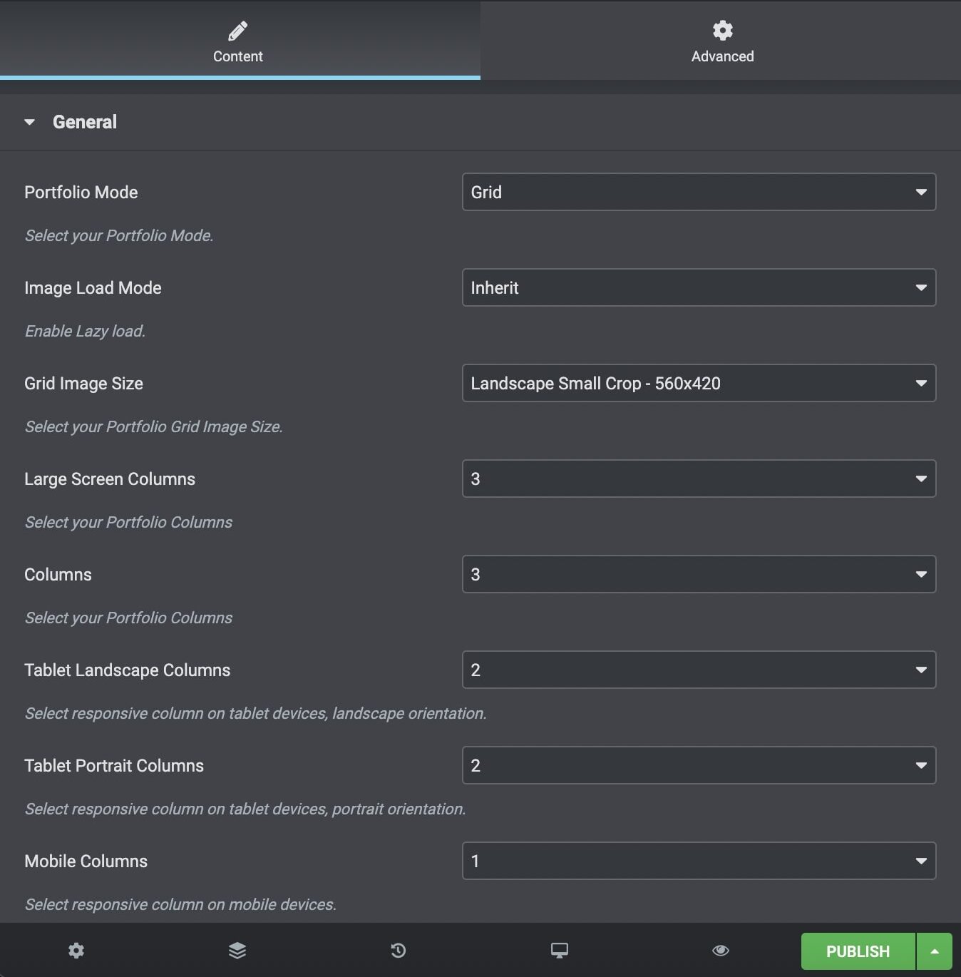
Portfolio Mode: Select between the Grid and Masonry portfolio mode.
Image Load Mode: Choose between Inherit/Off/Native Lazyload/Theme Lazyload.
Image Size: For the Grid Mode, you can select among Square Small Crop, Landscape Small Crop, Landscape Medium Crop, Portrait Small Crop, Portrait Medium Crop, Resize (Large), Resize (Medium Large) and Resize (Medium). For the Masonry Mode, you can select among Auto Crop, Resize (Large), Resize (Medium Large), Resize (Medium) and Custom (set by single portfolio media section).
Large Screen Columns: Select the portfolio columns you wish to have on large screens.
Columns: Select the number of columns you want to display.
Tablet Landscape Columns: In landscape orientation, select the number of columns on tablet devices.
Tablet Portrait Columns: In portrait orientation, select the number of columns on tablet devices.
Mobile Columns: Select the number of columns on mobile devices.
Gutter Between Items: Choose yes if you wish to add a gutter between your items.
Gutter Size: Choose the gutter size.
Order By: Select how you want to display your post: date, last modified date, number of comments, title, author, and random.
Order: Select if you wish your order post to be descending or ascending.
CSS Animation: Select your type of animation if you want this element to be animated when it enters the browser’s viewport. Note: It works only in modern browsers.
Bottom Margin: You can use px, em, %, etc. or enter just a number, and it will use pixels.
Extra Class Name: If you wish to style a particular content element differently, use this field to add a class name and refer to it in your CSS file.
Element ID: Enter your element ID, just make sure it is unique.
Styles and Titles
Portfolio Style: Define the Portfolio Style between 6 different styles that are available.
Indicator: Choose your indicator between None, Arrow, Plus, Text.
Image Effect: Choose the grayscale effect among Grayscale Image, Colored on Hover and None.
Overlay Color: Choose the image color overlay.
Overlay Opacity: Choose the opacity for the overlay.
Shadow: Select if you prefer shadow in the element.
Border Radius: Select the border radius.
Image Title and Description Visibility: Define the visibility for your portfolio title – description. You can select among Title and Description, Title Only, Description Only and None.
Title Tag: Select your Portfolio Title Tag for SEO.
Title Size/Typography: Select your Portfolio Title size and typography, defined in Theme Options – Typography Options.
Title Color: Select the color for Title.
Description/Text Color: Select the color for Description and Text.
Pagination and Extras
Items per Page: Enter how many items per page you want to display.
Display Style: You can select among Show All, Pagination, Load More and Infinite Scroll.Items per Page: Enter how many items per page you want to display.
Link Type: Select the link type of your portfolio items among Classic Portfolio, Quick View, Gallery Usage and Custom Link.
Overview Type: Select the overview type of your portfolio items among Default and custom Overview.
Image Popup Size: Select size for your popup image, only for the Gallery Usage link type.
Filters
Filter: If you selected it, an isotope filter will be displayed. Enable Blog Filter (Only for All or Multiple Categories). You can select your filter order, style and alignment and text for All.
Categories
Exclude Posts: Type the post ids you want to exclude separated by comma ( , ).
Portfolio Categories: Select all or multiple categories.
Include Specific Posts: Type the post ids you want to include separated by comma ( , ). If you define specific post ids, Exclude Posts and Categories will have no effect.
You can also discover the Portfolio Carousel Element – Elementor. and the Portfolio Broken Element – Elementor.