General
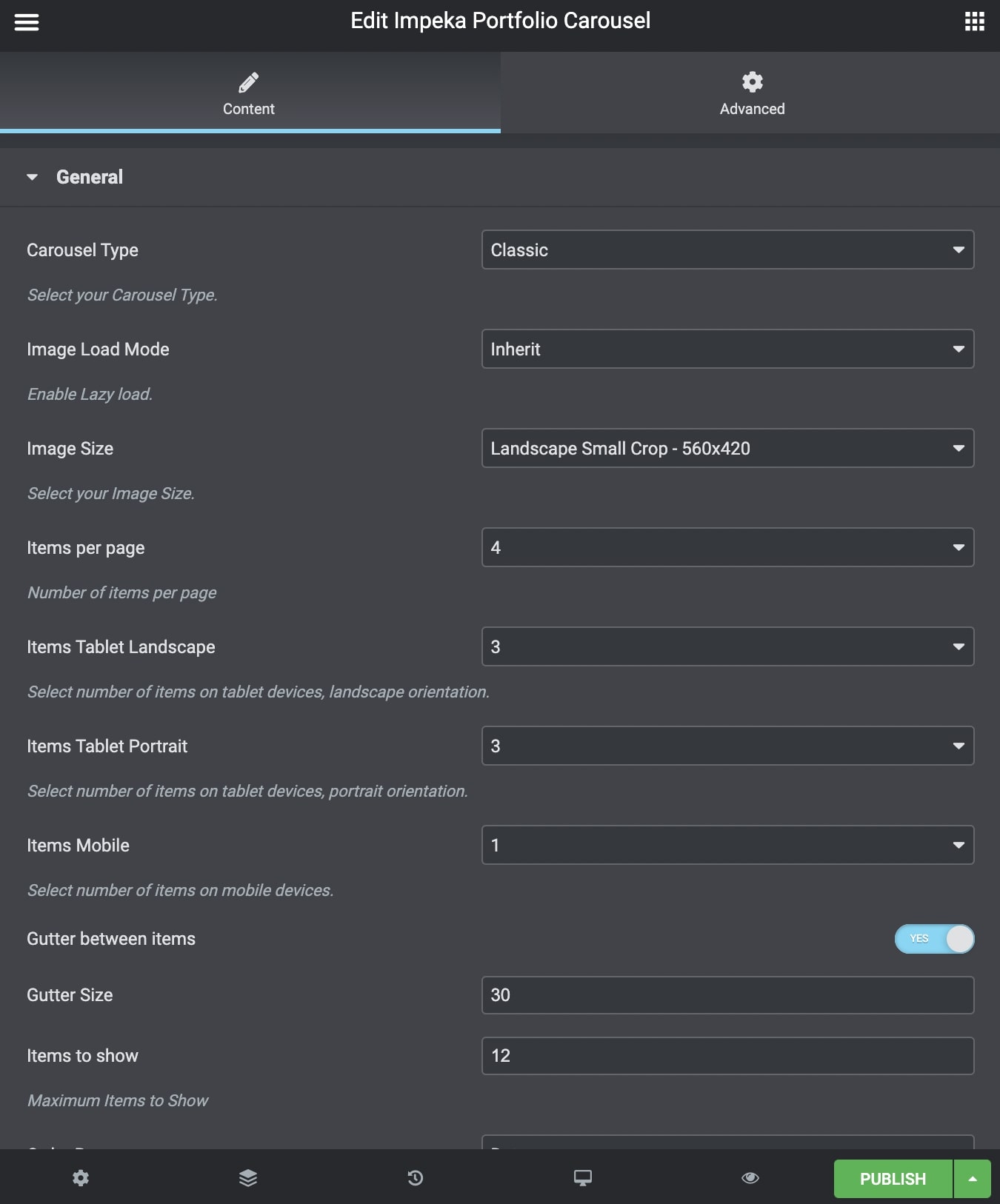
Carousel Type: Choose between Classic Type and Advanced Type. Classic is the classic Carousel with many options though and Advanced Carousel gives even more style options.
Below, we present all the possibilities offered for both Carousel Types. Note down that not all of those are available for each type.
Image Load Mode: Choose between Inherit/Off/Native Lazyload/Theme Lazyload.
Image Size: You can select your blog image size among Square Small Crop, Landscape Crop and Portrait Crop and Resize sizes.
Items per Page: Select the number of items you want to display per page.
Items Tablet Landscape: Select number of items on tablet devices, in landscape orientation.
Items Tablet Portrait: Select number of items on tablet devices, in portrait orientation.
Items Mobile: Select number of items on mobile devices.
Items to show: Enter how many items you want to display.
Gutter Between Items: Choose yes if you wish to add gutter between your items.
Gutter Size: Choose the gutter size.
Order By: Select the way you want to display your post among Date, Last Modified Date, Number of comments, Title, Author and Random.
Order: Select if you wish your order post to be Descending or Ascending.
Bottom Margin: You can use px, em, %, etc. or enter just a number and it will use pixels.
Extra Class Name: If you wish to style a particular content element differently, then use this field to add a class name and then refer to it in your CSS file.
Styles and Titles
Portfolio Style: Define the Portfolio Style between 4 different styles that are available.
Image Effect: Choose the grayscale effect among Grayscale Image, Colored on Hover and None.
Overlay Color: Choose the image color overlay.
Overlay Opacity: Choose the opacity for the overlay.
Shadow: Select if you prefer shadow in the element.
Border Radius: Select the border radius.
Image Title and Description Visibility: Define the visibility for your portfolio title – description. You can select among Title and Description, Title Only, Description Only and None.
Title/Description Auto Resize: Define if you need to auto resize title and description.
Title Tag: Select your Portfolio Title Tag for SEO.
Portfolio Title Size/Typography: Select your Portfolio Title size and typography, defined in Theme Options – Typography Options.
Title Color: Select the color for Title.
Description/Text Color: Select the color for Description and Text.
Navigation
Loop: Select if you wish to use the loop or not.
Autoplay: Select if you wish to have autoplay or not.
Slideshow Speed: Type your slideshow speed in ms.
Pause on Hover: If you select it, your Carousel will be paused on hover.
Navigation Visibility: Choose if you need Navigation or not.
Navigation Icon: Select one of the three icon styles.
Navigation Icon Color: Select the icon color.
Navigation Shape: Select the navigation shape.
Navigation Shape Type: Select shape type between Simple and Outline.
Navigation Shape Color: Define the shape color.
Pagination Visibility: Choose if you want your Carousel to have pagination or not.
Pagination Speed: Type your pagination speed in ms.
Extras
Link Type: Select the Link Type between Classic Portfolio, Quick View, Gallery Usage and Custom Link.
Overview Type: Select the overview type between Default and Custom Overview
Categories
Exclude Posts: Type the post ids you want to exclude separated by comma ( , ).
Portfolio Categories: Select all or multiple categories.
Include Specific Posts: Type the post ids you want to include separated by comma ( , ). If you define specific post ids, Exclude Posts and Categories will have no effect.
You can also discover the Portfolio Element – Elementor and the Portfolio Broken Element – Elementor.