Somentra offers handcrafted Gallery element and Gallery Broken element in Elementor.
Each Images Mode has different options. We will see them all together below.
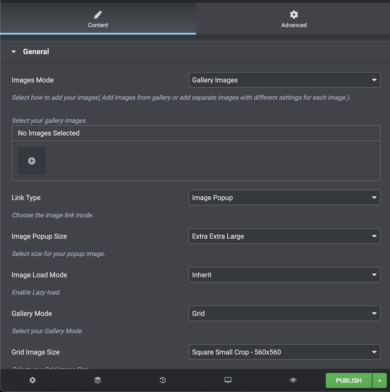
General
Images Mode: Select how to add your images (Add images from gallery or add separate images with different settings for each image)
Images: First you select your images for gallery or single images mode.
Link Type: Select if you need an Image Popup link to your images.
Image Popup Size: Select the image size on popup link.
Image Load Mode: Enable Theme or Native Lazy load.
Gallery Mode: Select Gallery Mode between Grid and Masonry for Gallery element and one of the four layouts for Gallery Broken.
Image Size: Select Grid/Masonry image size. For the Grid Mode, you can select among Square Small Crop, Landscape Small Crop, Landscape Medium Crop, Portrait Small Crop, Portrait Medium Crop, Resize (Large), Resize (Medium Large) and Resize (Medium). For the Masonry Mode, you can select among Autocrop, Resize (Large), Resize (Medium Large) and Resize (Medium).
Large Screen Columns: Select the gallery columns you wish to have on large screens.
Columns: Select the number of columns you want to display.
Tablet Landscape Columns: Select number of columns on tablet devices, in landscape orientation.
Tablet Portrait Columns: Select number of columns on tablet devices, in portrait orientation.
Mobile Columns: Select number of columns on mobile devices.
Gutter Between Images: Choose yes if you wish to add gutter between your images.
Gutter Size: Type the size you want for the gutter.
CSS Animation: Select type of animation if you want this element to be animated when it enters into the browsers viewport.
Bottom Margin: You can use px, em, %, etc. or enter just number and it will use pixels.
Extra Class Name: If you wish to style particular content element differently, then use this field to add a class name and then refer to it in your css file.
Titles and Hovers
Image Title & Description Visibility: Select your if you need to display both, only one or none.
Hover Style: Select one of 6 gallery hover styles.
Indicator: Choose your indicatior between None, Arrow, Plus, Text.
Overlay Color: Choose the image color overlay.
Overlay Opacity: Choose the opacity for the overlay.
Image Effect: Choose the grayscale effect among Grayscale Image, Colored on Hover and None.
Shadow: Select if you prefer shadow in element.
Border Radius: Select the border radius.