Setting your Rows
It is very important for the user to know the options Movedo offers in Rows in order to place correctly the elements given.
Options are plenty; let’s have a look:
General
Section ID
Give a name/ID for the section (row). This will be useful if you need an anchor menu or create a one page (see Anchor Menus in this documentation).
Font Color
Choose the color for your fonts so texts will be readable.
Heading Color
Set the color for your headings. Select among default, light, dark or one of the primary colors.
Extra Class
In case that you like to use one of your classes.
Section Options
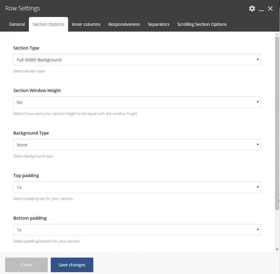
Section Type
Select among 2 different row types.
- Fullwidth Background – the background color will be stretched, this is the default option.
- Fullwidth Element – the content of this row will be stretched and not just the background.
Section Window Height
Select if you like your section has the window height (just for this section and for all page’s sections.
Background Type
Select the background for your section (row). You can use none, color, image or hosted video and set your preferences. In case you use a background image, you can have default mode, parallax effect, animated image or even use the image as pattern.
Top Padding
You can easily adjust the padding top of your section (row).
Bottom Padding
You can easily adjust the padding bottom of your section (row).
Bottom Margin
Set the margin-bottom of your section (row).
Inner Columns
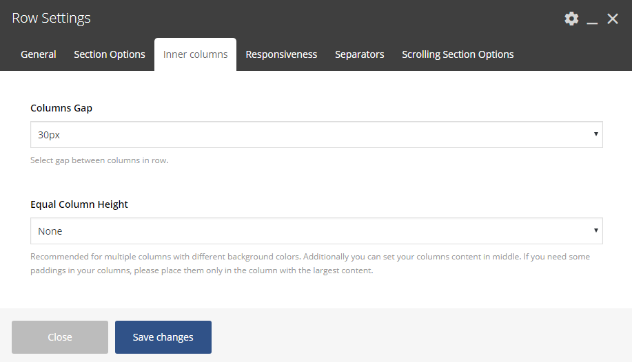
Columns Gap
Here you are able to select the gap among columns in this row.
Equal Column Height
The default option is None here and Movedo provides two more: Equal Height Columns and Equal Height Columns & Middle Content. Recommended for multiple columns with different background colors. Additionally you can set your columns content in middle. Finally, if you need some paddings in your columns, please place them only in the column with the largest content.
Responsiveness
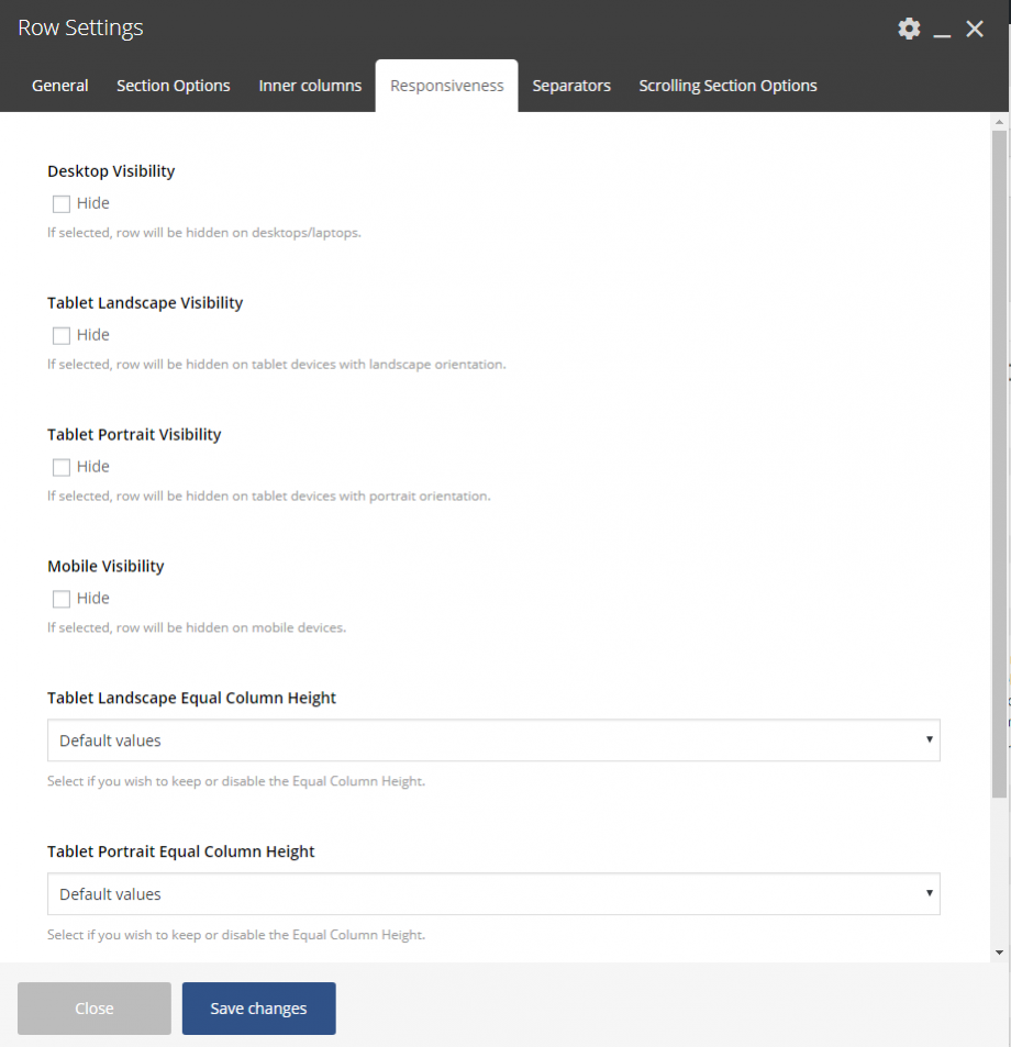
Here you can hide any row/section you prefer on devices. You can hide rows on tablet, both landscape and portrait orientation, and on mobiles.
Desktop Visibility
If selected, the row will be hidden on desktops/laptops.
Tablet Landscape Visibility
If selected, the row will be hidden on tablet devices with landscape orientation.
Tablet Portrait Visibility
If selected, the row will be hidden on tablet devices with portrait orientation.
Mobile Visibility
If selected, the row will be hidden on mobile devices.
Separators
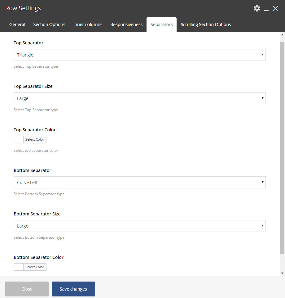
Top Separator
Select the separator you need for the top of your row. Then define its size (Small, Medium, Large, Extra Large) and its color.
Bottom Separator
Select the separator you need for the bottom of your row. Then define its size (Small, Medium, Large, Extra Large) and its color.
Scrolling Section Options
These options will take affect only if you use the Scrolling Full Screen Sections template.
Header Style
You can select the Header style, between Light and Dark, for this specific row.
Scrolling Section Title
Give a title for this row for the side dot navigation.


