Somentra never stops to impress you. In the HTML5 Video section, you have the possibility to upload your files in three different formats (WebM, MP4, OGV). You can place it above or below your site header and choose among endless possibilities that Somentra offers you. You can set your preferred color, type your description, choose your overlay. Moreover, you can set the video loop to off if you wish to play your video just once, set the muted to on or off and select if you wish to have video effect or not. What else could someone ask for?
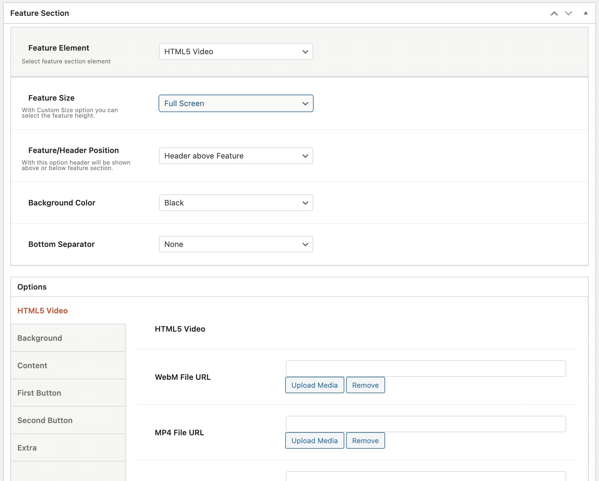
Have a closer look:
Feature Size: You can select the size of the feature title between Full Screen and Custom Size. With the Custom Size option, you have the possibility to adjust the feature height.
Feature/Header Position: You have the option either the header to be shown above the feature section or below it. Header above feature or Header below Feature.
Background Color: You can choose one of the background colors given (transparent, gradient, dark, light, primary 1 to 6) or customize it by yourself by selecting the custom option.
Bottom Separator: A large variety is given to you to choose among. If you do not wish to use a separator you can select None.
Afterwards, you can define the options for the HTML Video, the Background, the Content, the First Button, the Second Button and the Extra.
HTML5 Video
WebM File URL: Here, you can upload your WebM video file.
MP4 File URL: Here, you can upload your MP4 media file.
OGV File URL: Here, you can upload your OGV media file.
Use Fallback Image as Poster: Select if you wish to use a fallback image as poster or not .
Show video on devices: Choose if you wish you video to be shown on devices or not.
Loop: Select if you want to have loop or not.
Muted: Choose if you want your video to be muted or not.
Video Effect: You can define the effect between Animated and None.
Background
Background Image: Here, you can upload your background image.
Background Image Size: You can select the size of your background image among Responsive, Extra Extra Large, Full or Inherit. If you choose Inherit you can define it under Theme Options – Media Sizes.
Background Position: Select the position of your background. A lot of options are given.
Background Position (Tablet Portrait): It concerns tablet devices with portrait orientation and below.
Background Effect: Choose the effect for your background among Animated, Classic Parallax, Advanced Parallax or Fixed Section.
Pattern Overlay: Select if you wish to have a pattern overlay or not.
Color Overlay: You can choose your color overlay among Gradient, Dark, Light, Primary 1 to 6 or Custom.
Opacity Overlay: Here, you can define the opacity of your overlay in %.
Content
Container Size: You can select the size of your container between the default one and the large one.
Graphic Image: Here, you can upload your image.
Graphic Image Size: You can choose your graphic image size between Resize (Medium) and Full Size.
Graphic Image Max Height: Here, you can define the max height of your graphic image.
Graphic Image responsive Max Height: Here, you can define the max height of your graphic image for the responsiveness.
Sub Heading: You can write your sub heading.
Title: Type your title.
Description: Type your description.
Content Background Color: Here, you can select the background color of your content among None, Dark, Light, Primary 1 to 6 or Custom.
Sub Heading Color: You can choose your subheading color among Dark, Light, Primary 1 to 6 or Custom.
Title Color: You can choose your title color among Dark, Light, Primary 1 to 6 or Custom.
Description Color: Select among Dark, Light, Primary 1 to 6 or Custom.
Sub Heading Tag: Select the tag for your sub heading.
Title Tag: Choose the tag for your title.
Description Tag: Choose the tag for your description.
Sub Heading Size/Typography: Select the size for your sub heading.
Title Size/Typography: Select the size for your title.
Description Size/Typography: Select the size for your description.
Sub Heading Font Family: Select the font family for your sub heading.
Title Font Family: Select the font family for your title.
Description Font Family: Select the font family for your description.
Content Size: Here, you can choose the size of your content among Large, Medium or Small.
Content Alignment: Select the alignment of your content from Left, Right or Center.
Content Position: A large variety of options is given to you for the position of your content.
Content Animation: Choose the animation you want to have for your content. You can select eight options.
First and Second Button
Button Text: Here, you can enter the text for your button.
Button URL: Enter the URL in which your button will be direct to.
Button Target: Select if you want the button to be opened on a new page or in the same page.
Button Type: Select if you wish to have a Simple, an Outline or a Gradient type.
Button Color: Choose the color of your button.
Button Hover Color: Select the hover color of your button.
Button Hover Action: Select the button hover between None and Pulse.
Button Size: You can choose the size of your button among Extra Small, Small, Medium, Large or Extra Large.
Button Shape: Here, you can select the shape you wish for your button. Your options are Square, Round and Extra Round.
Button Shadow: Select the shadow of your button among Small, Medium, Large or None.
Button Class: Type the class of your button.
Extra
Scroll to Content: You can select among None, Arrow or Text.
Extra Class: If you wish to style this element differently, then use this field to add a class name and then refer to it in your css file.